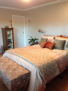
The interior designer’s knack for cushions
I like to think that I am really good at what I do, that I have a real instinct for this whole interior design thing. And I do, for the most part. But I must admit to one major failing, which is that I often feel defeated by cushions! It’s one of those secret little tricks at which all interior designers are meant to be experts. But they never had that class at design school. And while I have an instinct and a knack for many other important details of design, laying out cushions is not one of them.
While renovating, I also planned some new soft furnishing aspects of our décor. There are now new cushions in several areas around the house. But the bed layout was the really critical one.
I have always loved the look of a bed piled with more pillows and cushions and bolsters than almost anyone could reasonably expect to use! In San Francisco, I would wander the bedding sections of the high end department stores, just to swoon and drool over their lush and amazing displays. So now that I have a walk in closet not only big enough to house all of mine and my husband’s clothing and shoes, but also room to store the multitude of cushions when not in use, it was time to finally get that bed looking right!
This is my basic set up and just one option using about half of my cushions and pillows. There is another set that goes with different coloured sheets, and a big bolster that matches the bench at the end of the bed.
A key to finally getting it looking right was to store most of the pillows that we sleep on in the closet when not in use. Unless you like a very hard, firm pillow, and most people don’t, they just never stand up right when making the bed for show.
In the next photo, you can see the paint treatment on the back wall. Generally a very difficult thing to capture in a photo, the wall and doors have been painted with Porters Paints Duchess Satin. This a very luxurious, very glam finish that is not only high gloss but has a lovely satin finish when hand painted with a brush so that the brush strokes are visible. Everyone thinks it’s wallpaper, it looks that great!
For more photos of this bedroom, check out the Templer Interiors Facebook page. And please like us to get automatic notifications of new blog posts.
The renovation and design is complete. Check back soon for more photos, including Before and Afters, and how we survived the process!

