A Better Window Covering
Don’t you just love Before and Afters? I do. But in the magazines you see a small black and white “before” photo followed by many glamorous “after” photos. It always looks like the room has been made extra messy, or the model has just rolled out of bed after a rough night! I will be posting before and afters as I begin the process of renovating the big house we bought last year. But I promise not to mess up the rooms or be photographed as I roll out of bed! And if I can manage not to forget before the sledgehammers go to work, I will take enough detailed before shots so that the afters make sense.
So here, entry number one in the renovation chronicles. A very small one I admit, not a renovation at all. But this small thing has made a big difference in elevating the first impression of our home, the entry.
Our house, in a leafy suburb of wide residential streets in central Auckland, has huge windows all around. Especially in the public rooms. Wide sliding doors on two sides (soon to be three) open onto decks. Long and, in many places also tall, windows feature in every room. There is even a second stack of long windows along the front of the house. This amount of glass, and view of the outdoors, will affect every aspect of my interior design. It has already contributed to my confusion about paint colours, but more on that in a later post.
While I try to be patient about the design process, what needed quick attention were the horrible, ancient aluminium Venetians on every window, big, small or sliding. Some have been replaced with beautiful, off white painted Venetians, wide 60mm slats, which look so elegant. Venetians gave me not only the look I prefer, more of a warm, furniture look than roller blinds, but also the function I need, the ability to adjust privacy, light and air flow. We have nice, deep recesses at all windows and sliding doors. Except at the entry. Here was a challenge!
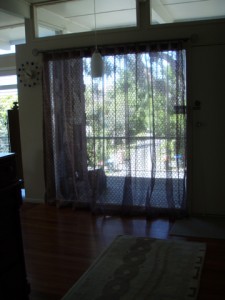
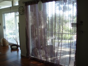
Our house is built in classic mid-century modern style, very open plan, with the entry, lounge, and dining area all flowing into one big space without visual obstruction. So all the blinds are the same. At the entry, just next to the front door, there is a big window, a single large glass panel. But, no recess. If I used the same blinds here, they would be sticking out into the room, into the walkway, and would just look wrong. Solution? Well, curtains of course. But I wanted the light and the openness, so I went for sheers. And not just any plain sheer, no, these are gorgeous!
BEFORE:
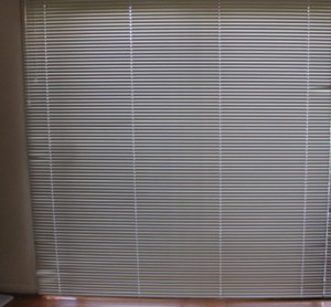
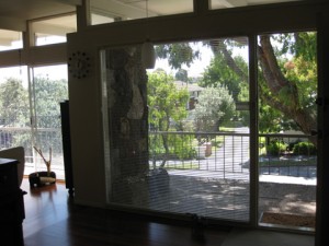 Not so terrible, right? Except that 99% of the time, the blinds were shut and looked like this:
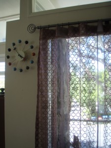
And never forgetting the function and the practical, the window has had a new tinted film applied. This film gives 90% UV protection so the fabric won’t fade, and is mirrored on the outside. So now I can have my view always, while maintaining privacy. And it looks so nice ;-)

