A Few More Words About Colour
Resene, the foremost paint company in New Zealand, publishes a weekly email newsletter. As one would expect from a paint company, this newsletter features creative uses of colour. I have written previously, on this site, about my feelings about colour. How I love using it, and how I struggled with use of colour in the beautiful, but very different, light of New Zealand.
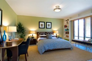
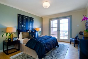
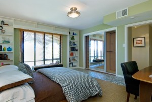
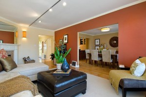
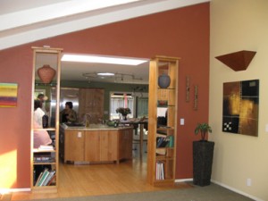
But I did work my way through my struggles with colour during the renovation of my home. I am happy with the results, and it would seem, Resene agrees. Have a look at this article, posted today, on Resene’s website, for some peeks at how I used paint throughout my home.
Templer Interiors wins Best of Houzz!
 |
Templer Interiors of Auckland Receives
Best Of Houzz 2014 Award
Annual Survey and Analysis of 16 Million Monthly UsersReveals Top-Rated Building, Remodeling and Design Professionals in New Zealand
Auckland, New Zealand, February 4, 2014 – Templer Interiors of Auckland has been awarded “Best Of Houzz” by Houzz, the leading platform for home remodeling and design. The Reseidential Interior Design company, which specialises in kitchen and bathroom design, was chosen by the more than 16 million monthly users that comprise the Houzz community.
The Best Of Houzz award is given in two categories: Customer Satisfaction and Design. Customer Satisfaction honors are determined by a variety of factors, including the number and quality of client reviews a professional received in 2013. Design award winners’ work was the most popular among the more than 16 million monthly users on Houzz, known as “Houzzers,” who saved more than 230 million professional images of home interiors and exteriors to their personal ideabooks via the Houzz site.
“Houzz is a fantastic resource for design ideas. I direct all of my clients to Houzz for inspiration during the design process”. – Susan Templer, Templer Interiors
“Houzz provides homeowners with the most comprehensive view of home building, remodeling and design professionals, empowering them to find and hire the right professional to execute their vision,” said Liza Hausman, vice president of community for Houzz. “We’re delighted to recognize Templer Interiors among our “Best Of” professionals for customer satisfaction as judged by our community of homeowners and design enthusiasts who are actively remodeling and decorating their homes.”
Follow Templer Interiors on Houzz http://www.houzz.com/pro/zsuzsanna22/templer-interiors
Specialising in kitchens, bathrooms and renovations for residential interiors. Susan Templer helps you design a look that is truly your own. With her international background, she has experience with a wide range of products and design choices. From small renovation to complete new build, Susan offers design, product selection and project management for kitchens, bathrooms and interiors.
The interior designer’s knack for cushions
I like to think that I am really good at what I do, that I have a real instinct for this whole interior design thing. And I do, for the most part. But I must admit to one major failing, which is that I often feel defeated by cushions! It’s one of those secret little tricks at which all interior designers are meant to be experts. But they never had that class at design school. And while I have an instinct and a knack for many other important details of design, laying out cushions is not one of them.
While renovating, I also planned some new soft furnishing aspects of our décor. There are now new cushions in several areas around the house. But the bed layout was the really critical one.
I have always loved the look of a bed piled with more pillows and cushions and bolsters than almost anyone could reasonably expect to use! In San Francisco, I would wander the bedding sections of the high end department stores, just to swoon and drool over their lush and amazing displays. So now that I have a walk in closet not only big enough to house all of mine and my husband’s clothing and shoes, but also room to store the multitude of cushions when not in use, it was time to finally get that bed looking right!
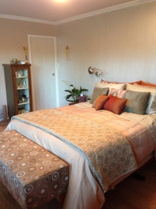
This is my basic set up and just one option using about half of my cushions and pillows. There is another set that goes with different coloured sheets, and a big bolster that matches the bench at the end of the bed.
A key to finally getting it looking right was to store most of the pillows that we sleep on in the closet when not in use. Unless you like a very hard, firm pillow, and most people don’t, they just never stand up right when making the bed for show.
In the next photo, you can see the paint treatment on the back wall. Generally a very difficult thing to capture in a photo, the wall and doors have been painted with Porters Paints Duchess Satin. This a very luxurious, very glam finish that is not only high gloss but has a lovely satin finish when hand painted with a brush so that the brush strokes are visible. Everyone thinks it’s wallpaper, it looks that great!
For more photos of this bedroom, check out the Templer Interiors Facebook page. And please like us to get automatic notifications of new blog posts.
The renovation and design is complete. Check back soon for more photos, including Before and Afters, and how we survived the process!
Jorrit’s Chocolate Fudge
This is the easiest, most delicious and most versatile recipe. You can use any kind of chocolate. You can swirl in caramel if you like. And you can add anything that you think will taste good. I’m a purist so I always use Whittaker’s 62% Dark Cacao. But I like to play around with what I add in, changing it around each year for the Christmas treats. This year I added dried strawberries and pistachios. Last year was dried cherries and almonds, another time dried cranberries and walnuts. But just about anything will work. And if you come up with some great combos, please share!
INGREDIENTS
500 g chocolate of your choice
1 can sweetened condensed milk
50 g butter (add more if using dark chocolate – I use 65 g with the 65% dark cacao – less if using white chocolate)
Nuts, dried fruits, etc of your choice, chopped – I generally add two items, ¾ – 1 cup of each
1. Melt chocolate slowly in a bain marie (a bowl over a pot of simmering water), stirring until there are no lumps
2. Remove the bowl from the heat, add butter and stir until melted
3. Add the sweetened condensed milk and stir until there are no white streaks
4. Add nuts and/or dried fruit and stir to combine evenly
5. Pour the mixture into a baking pan – I use a 20cm x 20cm x 50 cm deep Pyrex baking dish (*see tip below)
6. Refrigerate and store at least overnight
7. The fudge will be a hard block – remove and cut into serving pieces
Tip: To easily remove the block for cutting, line the dish or pan with baking paper or aluminium foil. If you run the paper or foil up the sides (use two sheets, overlapping on the bottom) you will have “handles” for lifting out. If you line just the bottom of the tray, use a knife repeatedly dipped in hot water to separate the fudge from the sides, then tip upside down to remove the block
Christmas Baking in my New Kitchen
I love baking. Well, I love cooking of all kinds, but baking is special. I love the precision required, following a recipe exactly to make sure of the perfect result. And when those beautiful cakes and tarts, breads and scones, come out of the oven looking as perfect as you hoped, what a sense of satisfaction.
I love being organised. I’m definitely a “place for everything and everything in it’s place” kind of gal. It can be so frustrating when you can’t find what you need, especially in the kitchen. Moving quickly to get everything ready, you can’t waste time looking for that garlic press, a pan, a platter, whatever you need must be easily at hand.
And counter space, okay let’s talk benchtops. One of my kitchen design signatures is loads and loads of functional work space. I like long, uninterrupted spans of countertop, with everything at hand, room to spread out and room to really WORK.
This year, for the first time in almost 4 years, I finally had that beautiful triumvirate working for me: baking, organisation and countertops. Add to that great appliances, great tunes and Christmas baking day was a slice of heaven.
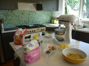
All set up for making my mini banana cakes. I make them in a muffin tin (you will see it to the left of the stove, all buttered and ready to go), but they definitely eat like little cakes, not like muffins. Very light, very moist. And this year I added toasted walnuts and chocolate chips. To the right of the stove is the cooling rack where they will go as they come out of my big, beautiful oven.
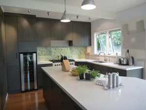
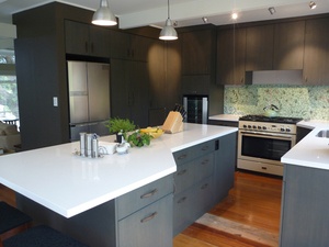
It was a real treat having all that counter space available when I was really into the thick of it (see more kitchen photos here). The girls got mini muffins this year, along with the most yummy chocolate fudge. The grown ups get banana bread. I made three this year, so it was wonderful having enough space to have everything going at once!
My Renovation – Christmas Update
Christmas has come and gone, New Year’s Eve a few days away and where am I on the renovation? Exactly where I wanted to be! It’s not often that can be said about a project of this size. I am almost afraid to tempt fate by admitting it, but so far, so good, with everything on track for continuing on after the break.
Product purchases have not always been smooth sailing. I never did find the white marble tiles I wanted, but I have found something even better, wait till you see the photos, that powder room will be amazing! From late November on I was ready to tear my hair out over vendors who would not return calls or emails. What’s wrong with these people, don’t they want to make a sale? But that’s okay, I found other avenues to the products I want and my purchasing is done.
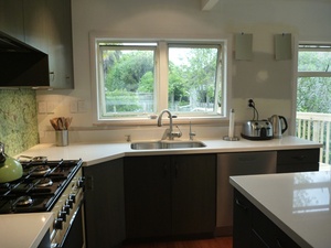
The kitchen is almost complete. It has been functional for several weeks and I’m loving it! Once the new pendant lights arrive, the walls are painted, the mosaic repaired and the floors refinished, it will look as great as it functions. And it really does work so well. There’s nothing like a personalised custom kitchen to ramp up the pleasures of cooking. I highly recommend it to everyone ;-)
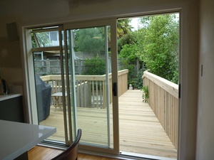
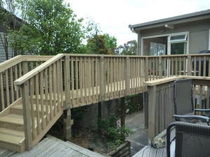
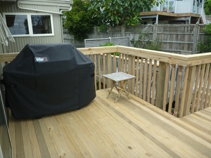
And the new deck is finished! We really wanted this for summer, preferably completed before Christmas, but the timing was always going to be touch and go. Waiting for the permit, waiting out the builders’ schedule on other projects, it was mostly fingers crossed on this phase. But the stars aligned and it all came together quickly, with the last nail in place within a day of the break.
My tradies have turned out even better than expected and I couldn’t be happier with my crew. My amazing builder came in under budget and ahead of schedule for both the deck and kitchen. The kitchen cabinets are built with a craftsman’s deft touch to every little detail. Everything works, no annoying leaks anywhere and so far I can honestly say I wouldn’t change a thing.
Best of all, the whole process has been pretty much painless. With good coordination in the scheduling and lots of follow up, there has been almost no down time. And we had a working kitchen of some sort for all but a handful of days. As project manager as well as client and designer, I will unabashedly take some of the credit. But there is no question that picking the right crew has been the number one key to the success of this project.
Phase 3 begins in less than two weeks. This is the really big part of the project, when my skills at organising will truly be put to the test. Stay tuned.
My Renovation
Plans have been in the works for a big interior renovation on my home since early this year. The last time I designed a renovation for myself, I was still living in San Francisco. It was one year before our move to Auckland and it was decided that a new bathroom would be an important selling feature. From decision to builders on site took 2 weeks, with all materials in place. Granted this renovation is much larger, but 9 months to get ready was a surprise.
Now that time frame is not at all unusual when I work with a client. But since I had the basic layout in my head even before we finalized our home purchase, I expected it would go quickly. What I had not counted on is the nature of shopping for materials in this big, sprawling metropolis, devoid of one central design center.
So I used this as an opportunity to educate myself. I can honestly say that now I can direct you to all the tile shops in Auckland and speak knowledgeably about the products within. Same for plumbing, flooring, lighting, furniture, you name it, I know where it is! Except that you can’t count on those products being there when you go back to buy them! But I get ahead of myself.
My house is on two levels. Currently the main living area is upstairs, but that will change so that we live equally on both floors. We will replace the kitchen, add and delete closets and shelves, all new lighting and re-work the function of some of the rooms. But walls and layout stay mostly intact.
Downstairs will change entirely. We will add walls to create rooms where there is one open rumpus space, build a new master bath, new laundry, walk in closets off of our new master bedroom. Since I already had a pretty good idea of the overall design, my first step was to select my products. There are essential details needed for any designer before sitting down to draw up installation plans. For example, I can’t lay out a kitchen until I know all the appliances, and for a bathroom I need to know the size and type of lavatories and taps. So I went shopping.
I got everything selected, all the big and small decisions sorted, then settled down to draw. I am an old fashioned girl, so I do hand drawings. I have an Autocad program, I have even taken a few classes. But I prefer the old way. With pencil to paper I work out all of the installation details of every little corner. And design and re-design as it comes to life in front of me. That also took longer than expected, as I learned to work in metric. That’s okay, it’s all done, it’s gonna be great and I’m happy!
Along the way I met with builders and various trades, including a wonderful joiner who so impressed me I decided that I would not bother with anyone elsefor my cabinets. Then I met another builder who impressed me in the same way, so he’s on board. A great electrician, plumber, tiler, painter and we’re off! Start date scheduled, with each phase following along to a projected March completion date. So it was time to start buying some of those things that I had selected all those many months ago. And so the trouble starts.
First stop, the limestone tile for the master bath. Which of course is no longer in stock! That means more shopping unless I want to wait 5 months, which I don’t. For the powder room, I want Statuario marble, that beautiful white stuff with the simple grey veins. I don’t need a lot, it’s a small room. But I want it in tile, and I want the real stuff, not porcelain, which I have yet to find. The simple side lights for the mirror cabinet are also not available in the style I want. And now I am worried about my plumbing fixtures.
Which all serves to remind me that I live in New Zealand now. A small country far away from everything. All the things I love about this place are also all the things that frustrate me. I was determined that my project would run smoothly, on schedule and I would not run into the usual delays that infect most projects here. And I am still determined that will be the case. I will have my beautiful home and I will use locally sourced products and materials!
So watch this space. Before and after photos and more on The Process, including how you live through it all, coming your way in future posts!
Even Better Roast Chicken
Last year I posted my favourite, perfect roast chicken recipe here. Since then I have tried a number of recipes, with different cooking methods, each claiming to be the best way to roast a chicken. And I have played around with my own variations on that theme. Of course, the absolute best, most succulent chickens will always be the ones you have brined or marinaded. But for quick and easy, and always perfect, here is my even better version.
All of the instructions from the original recipe remain the same, with a slight variation in cooking times and temperature only, as follows:
- Heat oven to 220 degrees C
- Add chicken, oiled and seasoned, back side facing up
- Cook for 30-35 minutes, watching that the skin does not char
- Remove chicken from oven (skin should be a rich mahogany colour) and follow original recipe instructions for flipping and adding veggies
- Return to oven and immediately lower temperature to 200 degrees C
- Cook for 35-40 minutes until juices run clear and legs bones pull away easily
- Rest, carve and enjoy!
Tile Design for Kitchens and Bathrooms
I’ve been thinking about tile design lately, maybe because I am designing my own renovation and so I’m thinking a lot about all design details. Or maybe it’s because I just love tile, and tile design. The trend today is for very simple, plain designs. Often described as “clean” it is essentially the absence of detail or colour. We have all seen this look: one colour throughout a bathroom, perhaps with a darker shade on the floors than on the walls. A nice trend that adds interest even to the one colour simple designs are all of the new brick tiles, rectangular rather than square shapes, in various sizes. But the trend for simple has these tiles installed in straight lines, like soldiers on parade, rather than the more classic offset installation.
But what do you do when you want something different? A little pizzazz, a little ooomph, or even just a little colour? It’s not that hard to make simple interesting. And if you are daring, I have some more extreme examples, so keep reading.
Simple, classic, yet still interesting is a good place to start:
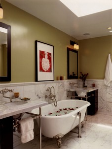
There isn’t much design needed for tile layout, anyone can do it. But what makes this example work, and look great, is the attention to detail. Most important with any type of stone is to match the pieces before installation. This particular white marble – and there are hundreds of quarries around the world so be assured that not all white marble will look the same – varies in the veining, from subtle to very agressive, and even in the colour – some of the white was not white at all, but tinged with green.
Here is a way to use large, relatively inexpensive tiles in an interesting and special way:
The wall and floor tiles are the same, just in two colours. It’s a beautiful, dramatic tile because of it’s size and modern shape. And yes, available in New Zealand. But what’s different? It’s use on the walls – this is generally a floor tile – and that it is running vertically up the wall, making low ceilings feel taller. But most interesting is that little accent strip. This is a very beautiful art glass tile that has been inserted at intervals around the walls to lend interest and draw your eye.
Here is another simple way to add something special:
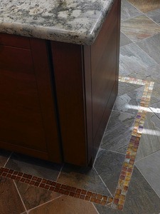
A sheet or two of expensive glass tile, using just two or three rows, running around a floor or on a wall, can elevate a basic tile installation. And at relatively low cost because of the small amount your will need.
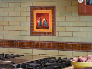
Or use the same treatment to highlight a special keepsake:
This is a hand painted tile picked up on trip to Mexico. It has great meaning, is very personal and in this application, helps create a very unique kitchen splash.
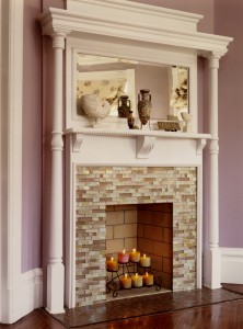
What about classic design gone modern? Have a look at this updated villa fireplace surround:
Any tile will do, and how much more interesting is this than brick or stone slab?
Sometimes a little accent can go a long way:
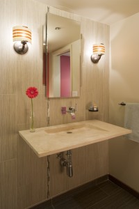
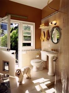
This is an inexpensive porcelain tile, the kind we all love to use, with the look of stone but the durability of a man made product. Simple squares laid on the floor, in the shower and up the walls. Not that special. Except when you add a colourful trim piece as a cap, plus a dramatic wall colour, and your inexpensive little guest bathroom is design magazine worthy. And without breaking the bank!
Another simple idea that will add interest to your basic white brick tile design:
You don’t need to find these specific tiles, the design idea is the same with any tiles. Whatever tile runs on the wall, pick a height to add a detail strip. Often a decorative tile with a design within is the easiest to add into your field tile (the field is the main tile used). In this example, we have not used a special decorative strip, simply a different colour tile in a different shape. Then added a small feature strip top and bottom to highlight, accentuate and add colour.
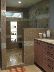
The same bathroom, using the same tile in a different application:
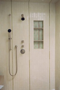
Using the same accent tiles in the back of the shower alcove lends interest to the alcove and also ties the wall tile in with the shower tile design. Another little trick to add interest here: the brick shaped tiles that run horizontally on the walls are run vertically in the shower. This is interesting and gives the illusion of height in this small room.
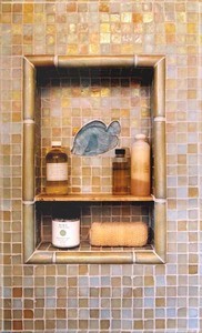
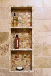
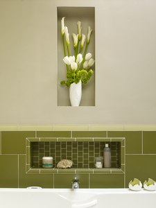
Which brings me to shower alcoves. I am absolutely mad for alcoves! Especially in bathrooms, where space is at a premium, I love to use all of those gaps between the framing boards for storage. For one of my favourite projects, we put five alcoves into one bathroom! There were two in the large shower, one above the tub, and two set into the walls for flower vases. But alcoves are also the ideal place to have some fun with tile. It’s a tiny area so the expenditure is low, but what a dramatic impact it can have! Here are just a few examples of fun alcoves I have designed:
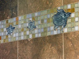
Okay, sorry, the turtles are not in an alcove, but I couldn’t resist adding them here ;-)
Some final ideas for you to think about when planning your tile designs, some simple, some not so, but all very special:
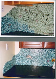
And finally, here’s a sneak peak of my custom mosaic backsplash, that moved all the way from San Francisco with me, and will soon re-appear in my Auckland home:
Happy Tiling!
Selecting Wall Colours – Some Tips
I am one of the lucky ones. I can visualize the finished look of a room and I have an instinct for what works well together. I suppose that’s why I do what I do. We all have our special skills, and I suppose this one is mine. But with a few basic tips you too can be on the road to having colour throughout your home.
WHITES – If you have visited a paint store recently you know that not all whites are alike and that there is a staggering variety to choose from. White will take on the colours of the environment and therefore it is very important to pick the right white. For example, in rooms with lots of beige or taupe, you must use a very bright, pure white. Any white with cream or yellow undertones will look dirty against the beiges. Alternatively, if you have warm colours in the room, either other paint colours or in your furnishings, a bright white will be too harsh. Here you would opt for a softer white, with a very slight yellow undertone. These rules apply for ceilings as well.
TRIM – White is still the preferred choice for door and window frames, crown mouldings and baseboards. Use the brightest, richest white, while staying within your preferred shade, either a pure, clean white, or a softer tone. And always use a semi-gloss finish. The gloss paints are not only easier to clean, but because they reflect light, the trims are highlighted in a very appealing way. Just be sure that they are well sanded and any imperfections corrected before painting as gloss paints also highlight all the faults! And all trim throughout the house should be the same colour to create a pleasing flow from one space to the next.
DOORS – There is no set rule on what colour to paint your doors. Some people prefer them to match the trim and the same throughout the house. Others prefer the door to match the wall colour, which means you may have a different colour on either side of the door. This is personal preference and I vary my decision based on the rest of the colours and where they are used in a room. For example, if I have painted an accent wall red, then a door on that wall might also be red, though the trim is white. This assures that the door is not a big distracting block of white. But if the whole room is painted red, then the white door is exactly what I need to brighten up the room and set off the red walls. Another example, and often a point of confusion, is what to do with the doors that open onto a long hallway, particularly if the hallway is not white. The only rule here is, whatever colour is selected, all the doors on the hallway side be painted the same colour.
COLOUR – Yes, it can be scary to move out of the white and beige comfort zones. But bringing colourful walls into your home is the easiest, and least expensive way to make a big impact on your interior design. I will touch on this more in a future posting on colour theory, how different colours make us feel and how they work in a room. But first, think about what colours you love, because these are the ones you can live with, and in. Give some thought to other colours in the room, but because of the huge choice in shades of a colour, you can always find something that will work. Using the example of the red walls again, the shade you select can vary from the cool pink and magenta reds, through to the bright lipstick reds, move onto the deep jewel tones, and finally to the soft and warm rust and terra cotta tones. Each of these will interact differently with other colours. But rest assured that if you want red, there is a shade out there that will work perfectly for you!
ACCENT WALLS – The safest way to experiment with strong colours is to create a feature wall, which is one wall in a room that is painted a different, darker colour. Feature walls work well placed opposite an entry, but the more important consideration is the orientation of the room and what will be against the feature wall, so it can work as a backdrop or a frame. In a lounge, this might be the wall where the TV and entertainment center sits, or the wall around the fireplace surround. If you have a very large window or glass door, this could be the accent wall, with the window or door frames trimmed in white, and the colour framing the glass and the outlook beyond. In a bedroom, the accent wall could be the one your bed is placed against.
CEILINGS – Here is the hardest design trick of all, what to do with the ceiling! This subject alone could take up an entire article, with lots and lots of varying opinions. The standard then, both easiest and safest, is to stick with white. I like to use the same white on the ceiling as is used throughout for the trims. But always, always use flat paint! Do not let anyone convince you otherwise. Because lights are either in the ceiling, or reflect up to the ceiling, any other finish but the flattest flat paint will show up every tiny fault and mark. Except for one very important exception to both rules – bathrooms. I always have the ceilings of a bathroom painted in the same colour as the walls. This a great trick for making a small room look bigger. Even if the walls are dark, that dark ceiling, contrary to popular belief, will expand the space. And in a bathroom, the ceiling paint should always be semi-gloss, just like the walls. This will go a long way towards protecting the finish and cutting down on mould.
ROOM TO ROOM – The open plan way we live today means that when you are choosing new colours for a room, you must also consider how they will work with colours in other rooms that open onto each other. If you want to repaint the dining room red, but your lounge is green, this is an important consideration. Not all reds go with all greens, and more important to decide is if you want to see these colours together, as you may depending where they are in relation to each other. You may need to change the shade of red, select a different colour, or also repaint the lounge.
TESTING COLOURS – Working with paint chips, narrow down your choices to three shade of each colour. Then, do not paint patches on your walls! I always cringe when I see this because it doesn’t work. The only time it might is if you are testing feature wall colours on the feature wall itself. Instead, get yourself a few pieces of good sized, heavy white board, such as foamboard or posterboard. Buy paint in the colours you have selected, hopefully these will be available in small test pots. Paint the boards as you would the wall: primer is not necessary, but be sure to do one coat, let it dry, then a second. Once the boards are ready, you can now move them around the room. Using boards this way you can see your colours in different light, on different walls, and up against other colours in the room. And you can move them from room to room. You can also assess each colour on it’s own without a lot of other patches to distract you. A much better way.
The last thing to remember is that if you don’t like it, you can always change it! Happy painting!

