Category Archives for Portfolio

Bright & Beautiful

Bright & Beautiful

Click to view project image gallery

Project Description

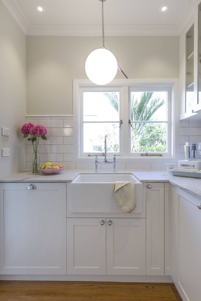
This classic Mt Eden villa needed a new kitchen that would suit the requirements of the owners, a couple that love to cook and who love to be surrounded by the finer things of life. To satisfy their requirements, traditional style cabinetry sits alongside top of the line appliances, including a custom designed hood. Italian glass pendants set off the lovely green walls and a little scullery serves as an additional work area for the messier chores.

Farmhouse sinks sit on platforms and appliances are hidden behind cabinet panels. Dining room cabinets match the style in the kitchen but flush toe bases and custom corbels evoke the look of bespoke furniture. And the richness and elegance of dark brown floor tiles creates a seamless flow throughout.

A Perfect Open Plan Kitchen

A Perfect Open Plan Kitchen

Click to view project image gallery

A Perfect Open Plan Kitchen

What a difference taking out a few walls can make! This stunning, huge, open plan kitchen started life as a pokey, dark and dreary little space at the opposite end of the room. Multiple walls were removed, loads of wide open stacking doors and windows were added, and a multi-use functional space has emerged.

Bright and shiny white cabinetry is enhanced with a splash back of antique mirror glass.  A corner desk and see through bookcases, functioning as a clever room divider, are useful and unique features. All of this is pulled together with gorgeous and hard wearing marble-look porcelain benchtops.

The Ideal Cook’s Kitchen

The Ideal Cook's Kitchen

Click to view project image gallery

The Ideal Cook's Kitchen

This bright and beautiful kitchen is perfect for anyone serious about cooking and baking. Glass fronted cabinet doors increase the sense of open space. Angled end cabinets add interest while fluted panels are just one of the special details in this simple but very elegant space. Tall cabinets hide a broom cupboard, washer dryer stack and linen cupboard. The addition of two sets of wide drawers on the back wall provide a perfect baking centre. Top of the line Miele appliances and wonderful interior storage complete this dream kitchen.

Traditional Kitchen adds Loads of Light

Traditional Kitchen adds Loads of Light

Click to view project image gallery

Project Description

The original plan for the new kitchen in this extensively renovated Kingsland Villa called for a walk in pantry behind closed doors, a much smaller window and generally less workspace. But with a few innovative ideas, this kitchen now feels anything but small.

The first, and most important, change was to delete the door and pantry, substituting cabinetry and continuous benchtop to increase storage and work area. In addition to giving the overall space a much more open feel, the immediate benefit was the ability to add a much larger window to enjoy the home’s expansive views. The benchtop narrows progressively towards the back wall, using angled cabinetry to provide adequate clearance. Open shelves on the opposite wall also contribute to the sense of space and a place for the owner’s collection of useful storage jars.

An old style AGA stove, butler sink, subway tiles, forged iron cabinet hardware and v-grove paneling accents are just a few of the features that are used to create traditional style in this lovely and hardworking kitchen.

After the Fire

After the Fire

Click to view project image gallery

Project Description

The owners of this home lost almost everything in a house fire. But being the positive couple that they are, they could look on the bright side. Now, at least, here was an opportunity to get the kitchen they had always wanted, in look, function and layout.

A wall between the former dining room and kitchen was removed and a second island added. The dining table moved to the over large and underused living room. And the peninsula separating the kitchen from the TV lounge now includes better cooking appliances on one side and an attractive bookcase on the other. A serving, storage and display area is flanked by a double pantry and substantial fridge while a large butler sink under the window makes prep on the smaller island a breeze.

The creamy white of the cabinets brightens the space while the Rimu islands are a nod to the timber furniture and flooring throughout the house. And best of all, the flow between the rooms has created a wonderful entertaining space for this very social couple.

Hardworking and Fun Too

Hardworking and Fun Too

Click to view project image gallery

Project Description

The kitchen in this classic Ponsonby villa was in dire need of updating. My clients requested a new kitchen that would operate as a modern and practical space. And they wanted it to look completely different than the old world, traditional style kitchen they had in the UK. This new world kitchen was to be sleek and contemporary, but with some personal touches to call their own.

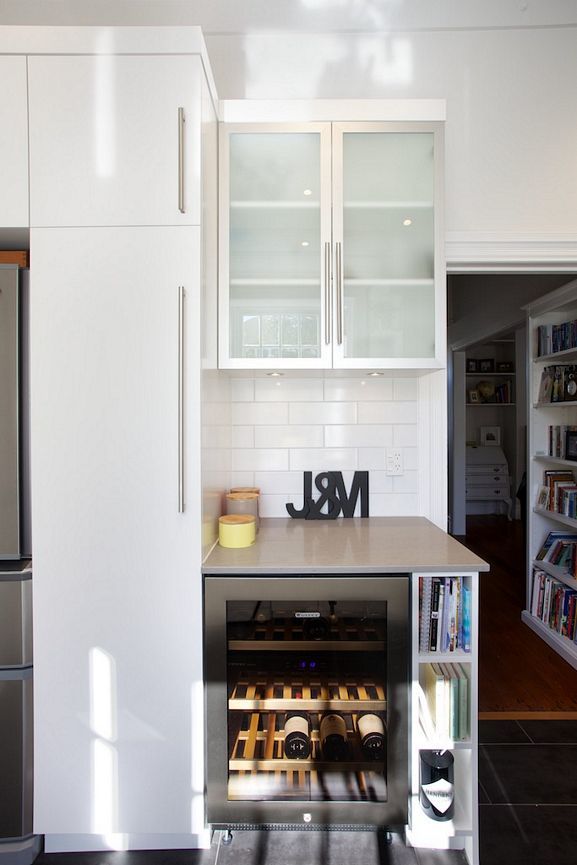
The appliance star that sets off the main wall is the large Falcon stainless steel range with matching hood. Aluminium doors break up the expanse of white painted cabinets, frosted glass adds lightness and a little sparkle, and long stainless steel pulls add vertical and horizontal accents throughout. A small bar area next to the tall fridge and pantry is practical and opens up the long narrow space. A large island, with cabinets on three sides, is the perfect work area and provides much needed additional storage.

But for personality and a unique touch, you can’t beat that long red wall! Here the perfect paint colour was chosen to match the owners’ favourite painting and the quirky red cushions at the dining alcove complete the look. Altogether, this lovely new kitchen is bright, fun and hardworking with all the necessities any cook could want.

Now We’re Cooking

Now We’re Cooking

Click to view project image gallery

Project Description

The challenge in this kitchen was to fit all of the professional grade appliances required by my client, an avid cook. We settled on choices that would both fit the relatively small space and allow my client to cook to perfection for her frequent dinner parties.

A large Wolf range is topped by a matching hood and a second small Wolf oven is installed in the island. Across the room is the drink and coffee bar area, which includes a wine fridge and second sink. This area is custom sized for a tall espresso machine, regularly operated by the man of the house, a connoisseur of fine coffee. The centre island has ample bench space and just enough room for two people to enjoy a light breakfast or a full dinner. This beautiful kitchen is hardworking, but also practical, as evidenced by the functional storage in everything from the pantry to cutlery dividers.

A Place for Everything

A Place for Everything

Click to view project image gallery

Project Description

The old kitchen in this mid-century style house was unattractive and impractical. And the dining area was squeezed into a space that could barely fit a small table for four. The new kitchen had to be as large as the space would allow, with loads of storage for a serious cook with a penchant for gadgets and cooking utensils. But walls that couldn’t be moved limited the design options. The solution was to relocate the dining area.

An extra wide hallway offered the needed space to add a dining area at the back of the living room, creating a lovely flow through to the new kitchen and on out to the new deck. To visually tie all the spaces together, the kitchen cabinets were built of oak and stained to match the dining room table.

Every detail has been meticulously planned for maximum storage without a millimeter of waste. Special storage inside the cabinets includes a chef’s pantry, spice racks, custom utensil dividers and a cleverly hidden rack for hanging skillets. A large Falcon range is in constant use but is visually upstaged by the custom mosaic splash back. But the most important feature of all is the large center island which provides loads of work space, cabinet storage all around and widens at the end for a comfortable eating area.

What looks like a second kitchen is actually a large laundry, with room for a hidden freezer and lots more storage space. With a place for everything, and everything in its place, great appliances, loads of work space, indoor outdoor flow and a beautiful look besides, this owner couldn’t be happier with this renovation that enhances the perfect modern home.

Step Down to the Bar

Step Down to the Bar

Click to view project image gallery

Project Description

Under the half floor of this open plan loft apartment, and running the width of the room in a narrow area, this kitchen came with an extensive wish list. It needed to have lots of storage, have a good flow for entertaining and it had to include the loft’s only dining area. Add to that a low ceiling, and there were challenges to spare!

The cabinets were extended the length of the wall, at three different depths to open the space as it flowed to dining, then entertaining areas. The upper cabinets are also stepped, from top to counter, to detract from the low ceiling. Metal cabinet doors shine against their dark neighbors, while the glass tile splash back echoes the colours in the fireplace and paintings. And in the corner, the perfect “mini bar” for entertaining.

Beauty Borrowed from the Sea

Beauty Borrowed from the Sea

Click to view project image gallery

Project Description

The original kitchen in this old villa, while charming and historical, was not practical for today’s modern homeowner. My client requested a kitchen that would be attractive and welcoming, with all the modern conveniences, while maintaining the period feel of the house. And it had to blend with her first appliance purchase, the very distinctive Falcon AGA range.

The painted cabinets are dressy without being formal while blending well with the dramatic colour scheme in adjoining rooms. Glass doors in all the upper cabinets make the room seem larger and matching panels hide appliances.

The island in this elegant room is topped with a single slab of unique blue granite, a daily reminder of my client’s love of deep sea diving. The white granite topping the cabinets along the back wall is hardworking and beautiful, rising to a traditional shape on the splash back.

1 2 3