Category Archives for Bathroom

Bathrooms Feature Traditional and Modern Styles

Bathrooms Feature Traditional and Modern Styles

Click to view project image gallery

Project Description

There are two new bathrooms in this Auckland Villa, one bathroom is traditional, the other modern. But both are beautiful, functional and fantastic!

An extensive renovation in a classic Kingsland villa included the additional of an ensuite off the new master bedroom. In this very petite space – only 1200x2400mm – we fit all the essentials: a roomy walk in shower, and wall hung sink and toilet. For storage there is a very large recessed mirror cabinet running almost the full width of the wall outside the shower. With space at a premium, a modern aesthetic was called for, black and white to keep it simple and clean, minimalist fixtures.

In the main bathroom, with more space to work with, we went for the more traditional style called for by the architecture, and preferred by the owners. Here a rain shower head sits over a roomy tub, timber panelling and subway tiles line the walls and bright blue paint echos the colour of the geometric cement tiles. A large vanity provides storage and space for a combination washer/dryer unit while the furniture style mirror cabinet with traditional scotia and old style glass wall lights complete the look of this beautiful and inviting bathroom.

Meeting the Challenge Beautifully

Meeting the Challenge Beautifully

Click to view project image gallery

Project Description

When the owners of this classic Mt Eden villa purchased their home, they knew that a bathroom renovation would be one of the first things on the agenda. But the space was limiting. Without major architectural changes, we had to work within the parameters of the odd shape of this split bathroom. But the most has been made of a difficult space to great effect and beautiful results!

The traditional style of this bathroom is updated with the use of a clean, fresh colour palette. The custom designed vanity, in the same soft green of the walls, is a perfect compliment to the bright white panelling and fixtures. The modern, trough sink is wide enough for two, and the very traditional taps marry the two styles with maximum practicality. To the side of the vanity, recessed cabinets disappear visually but contain loads of storage space.

The shower area was challenging as it narrows and angles back, but creative use of space makes this traditional style shower enclosure really special. The glass enclosed walk in shower makes the best use of a small space with a rainhead and hand shower next to a practical bench. To the side of the bench, a large recessed alcove has space enough for all your shower needs without the clutter.

Next door, the powder room delivers the “wow” factor we all want from this type of room. Elegant, welcoming and with unique styling, it’s the perfect statement for adding drama to a small space.

A Fresh Start

A Fresh Start

Click to view project image gallery

Project Description

After a tragic fire that destroyed everything inside this home, the owners had to renovate a master bath and ensuite for the second time since buying their home. The footprint remained the same but with the original materials no longer available, the design process had to start fresh.

The main bathroom tiles are a beautiful Italian porcelain with the look of limestone. Diamond shaped tiles in the same material are used as backsplash and alcove accent while natural pebbles on the floor of the shower pick up the warm timber shade of the custom stained vanity.

In the ensuite, a custom built vanity, sized to fit this petite space, is stained to match the Rimu bedroom suite that can be seen through the door. Matching framed mirrors complete the warm and inviting feel of these two bathrooms.

From Tired to Timeless

From Tired to Timeless

Click to view project image gallery

Project Description

The bathroom in this expansive North Shore home had once been the height of style. But that was a few decades ago so it was well past time for an update! The large main bathroom was not utilising space well, with the majority of the room given over to the bath and large tub deck. The shower was almost too small to turn around in and the tiny vanity did not provide the required storage space. My clients wanted to keep the bathtub but needed the other areas to be larger and more useful.

To gain space for the large and luxurious shower the water cylinder, which backed up to the original shower, was relocated to the laundry room. The tub deck is now of a minimal size and a large recessed alcove provides space for amenities. This left space for an expansive, and attractive, linen cabinet to replace storage lost from the cylinder closet. The vanity provides additional storage with lots of useful drawers, generous benchtop area and even some glass shelves.

The laundry was also updated, so that it looks better and provides more functional storage. This new bathroom and laundry are now as practical as they are beautiful.

Small But Perfectly Formed

Small But Perfectly Formed

Click to view project image gallery

Project Description

As is common to old villas in the Ponsonby area, the bathroom in this house opens from the kitchen. This was a major issue for the owners but, in this small home, there was no good alternative. So most important to the design of this bathroom renovation was to minimise the impact of it’s location, while staying to a strict budget.

The greatest impact, with the lowest price tag, was to close off a rarely used side door in the bathroom. This gave us more wall space to work with which resulted in more room overall for a nicer layout. The small tub was removed and replaced with a large, walk in shower with expansive glass walls. A wall hung vanity opens up the floor area while not taking attention away from the dramatic and unusual industrial style wall sconces on either side of the custom mirror cabinet. Black floor tiles run from the kitchen and continue into the shower to visually enlarge the room. And an impractical, messy closet has been transformed into a well organised and useful laundry with customised storage shelves.

Finally, a new door with frosted glass inserts was added so that the view from the kitchen is lovely to look at. This bathroom is small, but is now practical, spacious and perfectly formed.

A Better Use of Space

A Better Use of Space

Click to view project image gallery

Project Description

An interior renovation on two floors has much improved the use of space in this mid-century modern home. While the upstairs is greatly enhanced, the lower level has been truly transformed. Completely reconfigured, a collection of rooms that were either too large or too small are now useful and beautiful.

The old configuration had a laundry that was too large, a very large, rumpus room that opened onto a second kitchen, both of no use to the owners, a small split bath and a couple of tiny, cold rooms. The new layout takes the logical form of a home, with rooms opening off of a central hallway. And now all of the rooms are a proper size. The split bathroom arrangement has been maintained but with the second kitchen removed, both areas are now spacious and luxurious.

The master bathroom is truly spa-like, with double sinks, masses of benchtop and storage space, and a large walk in shower. The mirrors are all fog-free, including the large shaving mirror inside the shower. The tile floors are heated, the makeup mirror lights up and there is a deep, custom mirror cabinet recessed into the wall.

The powder room is an experience with it’s unique wallpaper while the black marble tiles are shot through with white strips, like lighting in the forest. The adjoining laundry, with hidden appliances, is inviting and cheerful, where in summer the back door opens onto a lovely courtyard garden.

Old is New Again

Old is New Again

tile design, marble tile, traditional, classic, claw foot tub

Click to view project image gallery

Project Description

My design for this bathroom in a renovated old villa is a nod to the original style of the house.

A free standing, claw foot tub is adorned with taps from a bygone era. Decorative polished nickel fixtures, with simple white marble on the floor and walls borrow from turn of the century style bathrooms while delivering 21st century performance. The bespoke vanities create a unique look, where exposed plumbing and a countertop suspended on one elegant metal leg impart an open feel, while an attached cabinet provides much needed storage space.

This small but efficient bathroom also includes recessed mirror cabinets and a laundry area complete with extra storage tucked into a recess behind the door.

Downstairs, the bathroom off the kitchen has been brightened with light tiles, warmed with caramel paint and has become a welcoming space, more walkway to the lovely pocket garden than the functional room it is. And Curley has his own dining area within!

Art Lovers in Residence

Art Lovers in Residence

Click to view project image gallery

​Project Description

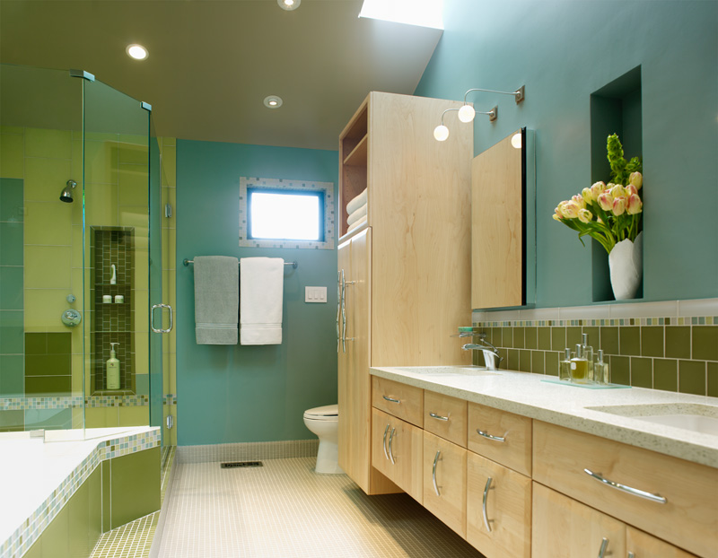
As art collectors, my clients asked that I bring their modern aesthetic into their master bathroom. They requested a space to match their personal style: clean and contemporary with unexpected and unique touches. In the tile design a patchwork quilt of muted blues and greens creates a completely fresh feeling and evokes an artist’s sensibility.

The final look is both bold and organic, creating blocks of color in a unique pattern that join seamlessly from one to the next. Natural materials enhance the room, from natural maple cabinets to the concrete and glass counter top.

A personal touch is the recessed alcoves for fresh flowers. And on the practical side, we had the space to include a double shower, double sinks, separate bath, and abundant storage space including three extra-deep medicine cabinets.

A Pair of Unique Bathrooms

A Pair of Unique Bathrooms

Click to view project image gallery

Project Description

These two bathrooms out of four in a large home are each unique in their own way. The first of these is an ensuite in the guest room. Since the bathroom is small, I compensated with dramatic style. Floor to ceiling mosaic tile, which is dark and richly hued, is used alone and without embellishment. When paired with a dark, luxurious paint colour that envelopes the room, the room takes on a warm and welcoming feel. An inset of bamboo flooring offsets the glass tile and helps to soften the room, as do the bamboo shelves in two even sets of alcoves for storage without the clutter.

The second bathroom, located near a pair of home offices, had to be functional but also serve as a private retreat. The light colour of the tile feels fresh and clean, the steam shower has a seat for relaxation, while floated shelves and strategically placed alcoves lend this small bathroom a feeling of space and luxury.