Category Archives for Portfolio

The Upside to Tragedy

The Upside to Tragedy

Click to view project image gallery

Project Description

There can be something positive that comes from even the greatest of tragedies. A fire in this home destroyed all of the owner’s furniture, along with most of their personal possessions. While they would never have wished for this to happen, the upside is that they had the opportunity to completely refurnish, and in many cases upgrade, their entire home.

The new family room and guest room reflect the owner’s love of deep blue tones while the new lounge suite has a more formal and elegant feel. New Italian style tiles in the entry way pick up the red tones of the lounge furniture while lots of open shelves in the family room display the possessions that were rescued from the fire along with new items picked up on their extensive travels.

Updating a Classic

Updating a Classic

Click to view project image gallery

Project Description

This classic Mt Eden villa has been rejuvenated with a fabulous renovation of dining room, kitchen, scullery, bathroom and powder room. Now the old girl can kick up her heels and party once more! My clients are true connoisseurs of all things stylish and fashionable. They have wonderful taste and exquisite collections of objets d’art from the classical to the quirky. This couple would never settle for the ordinary so design and materials had to be top notch.

In the kitchen and dining areas, the richness and elegance of dark brown timber-look floor tiles perfectly sets off brightly painted cabinetry. Custom dining room cabinets, painted the same colour as the kitchen walls, compliment the adjoining kitchen and offer loads of great practical storage. The unique and exceptional bar area glistens with jewel-like recessed lights that shine through glass fronted cabinet doors. The splash back is an antique’d mirror and opposite is a hutch with deep drawers and more glass cabinets, a pefect place for storing all that lovely serving ware.

In the bathroom and powder room, polished nickel tapware and porcelain sinks of the finest quality are showcased. Everything in these rooms is fine tuned to evoke an old world elegance that perfectly suits this lovely home, and it’s cultured occupants.

Mid Century Goes Modern

Mid Century Goes Modern

Click to view project image gallery

Project Description

Mid-Century Modern style is all the rage and this home is a classic of that era. A full house interior renovation has perfectly maintained that era’s design aesthetic while adding unique features. An open shelving unit divides the hallway from the lounge and is a perfect place for the owner’s beautiful coloured glass vases and other collectibles. The front door inserts have real hydrangea blossoms floated in resin panels. And a former master bedroom is now a library and comfy second lounge.

While the upstairs is greatly improved, it was the lower level that was truly transformed! Completely reconfigured, a collection of rooms that were either too large or too small have been converted into logical, practical and spacious living. There is a large master bedroom with a walk in double dressing room, separate master bathroom and powder room, large office and a new laundry. This whole house now features brightly painted walls, inviting rooms, custom cabinetry and fun wallpapers while ensuring that all the rooms are practical and well thought out.

All is New Again

All is New Again

Click to view project image gallery

Project Description

A spacious but outdated home was transformed into a retreat-like residence, a place for both relaxation and inspiration. My clients love contemporary art and design, and asked for a singular expression of their taste and aesthetic. And that it not be ordinary.

A custom mantel shelf is taken to it’s extra large extreme sits above the custom mosaic fireplace surround in the living room. And everywhere one looks are bold washes of colour, unique resin inserts in doors, cork floors, Italian art glass lighting, and there’s even a shower for the dog!

Some Fun with a Classic

Some Fun with a Classic

Click to view project image gallery

Project Description

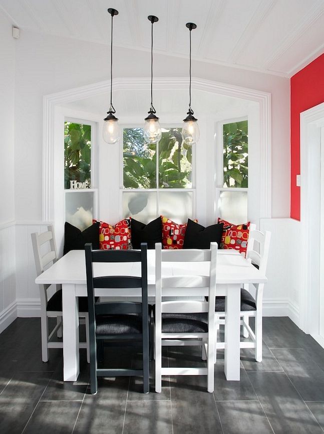
The kitchen and bathroom at the back of this petite Ponsonby villa was in dire need of updating. The house has no separate dining room, so the bay window alcove at one end of the long kitchen serves as a cozy dining area. My clients asked that the new plan be bright and practical but they also wanted it to be unique and special to suit their personalities.

Aluminium accents and stainless steel stand out in a classic pairing with bright, white cabinets. Industrial style pendant lights draw your eye to the original board and batten ceiling. Bright red paint frames a long wall with eye popping emphasis. And the dining area has been transformed while bringing the whole look together! Here an old, but sturdy timber table got new life with a coat of white paint to match the cabinets. The original matching chairs are a mix of black, grey and white to match the tile, benchtops and cabinets. New cushions add some fun with a bright red pattern that pulls it all together!

A New Era

A New Era

Click to view project image gallery

Project Description

When my client purchased this turn of the last century gem, all it had was potential. I was hired to help bring the home into the 21st century. The original kitchen was opened up to the dining room and completely updated. A small utility room off the kitchen became a new full bath. The upstairs bathroom was enlarged and a laundry area added along with a separate tub and shower. And the original fireplace mantel received a new, modern glass tile surround.

My client’s taste is diverse and eclectic. She owns antique sideboards and modern furniture along with many distinctive items from around the world. All of our design decisions incorporated this unique aesthetic. From paint colors to tile to light fixtures and cabinets, my client’s taste influenced our choices to create a personal statement and a beautiful home.

From History to Luxury

From History to Luxury

Click to view project image gallery

Project Description

The kitchen and bathroom at the back of this petite Ponsonby villa was in dire need of updating. The house has no separate dining room, so the bay window alcove at one end of the long kitchen serves as a cozy dining area. My clients asked that the new plan be bright and practical but they also wanted it to be unique and special to suit their personalities.

Aluminium accents and stainless steel stand out in a classic pairing with bright, white cabinets. Industrial style pendant lights draw your eye to the original board and batten ceiling. Bright red paint frames a long wall with eye popping emphasis. And the dining area has been transformed while bringing the whole look together! Here an old, but sturdy timber table got new life with a coat of white paint to match the cabinets. The original matching chairs are a mix of black, grey and white to match the tile, benchtops and cabinets. New cushions add some fun with a bright red pattern that pulls it all together!

A Cozy Lounge

A Cozy Lounge

Click to view project image gallery

A Cozy Lounge

A cozy and inviting area has been created in the corner of this large room. You can sink into the generous sofas while leaning on the soft cushions. Different patterns and styles of fabric are artfully combined on a theme of gray and blue. The window covering behind one of the sofas has a valence of coordinating fabric which softens the hard surface. A couple of beautiful ceiling fixtures complete the look of this fashionable and comfortable space.