Tile Design for Kitchens and Bathrooms
I’ve been thinking about tile design lately, maybe because I am designing my own renovation and so I’m thinking a lot about all design details. Or maybe it’s because I just love tile, and tile design. The trend today is for very simple, plain designs. Often described as “clean” it is essentially the absence of detail or colour. We have all seen this look: one colour throughout a bathroom, perhaps with a darker shade on the floors than on the walls. A nice trend that adds interest even to the one colour simple designs are all of the new brick tiles, rectangular rather than square shapes, in various sizes. But the trend for simple has these tiles installed in straight lines, like soldiers on parade, rather than the more classic offset installation.
But what do you do when you want something different? A little pizzazz, a little ooomph, or even just a little colour? It’s not that hard to make simple interesting. And if you are daring, I have some more extreme examples, so keep reading.
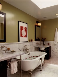
Simple, classic, yet still interesting is a good place to start:
There isn’t much design needed for tile layout, anyone can do it. But what makes this example work, and look great, is the attention to detail. Most important with any type of stone is to match the pieces before installation. This particular white marble – and there are hundreds of quarries around the world so be assured that not all white marble will look the same – varies in the veining, from subtle to very agressive, and even in the colour – some of the white was not white at all, but tinged with green.
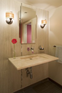
Here is a way to use large, relatively inexpensive tiles in an interesting and special way:
The wall and floor tiles are the same, just in two colours. It’s a beautiful, dramatic tile because of it’s size and modern shape. And yes, available in New Zealand. But what’s different? It’s use on the walls – this is generally a floor tile – and that it is running vertically up the wall, making low ceilings feel taller. But most interesting is that little accent strip. This is a very beautiful art glass tile that has been inserted at intervals around the walls to lend interest and draw your eye.
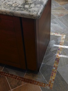
Here is another simple way to add something special:
A sheet or two of expensive glass tile, using just two or three rows, running around a floor or on a wall, can elevate a basic tile installation. And at relatively low cost because of the small amount your will need.
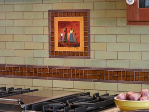
Or use the same treatment to highlight a special keepsake:
This is a hand painted tile picked up on trip to Mexico. It has great meaning, is very personal and in this application, helps create a very unique kitchen splash.
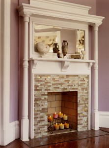
What about classic design gone modern? Have a look at this updated villa fireplace surround:
Any tile will do, and how much more interesting is this than brick or stone slab?
Sometimes a little accent can go a long way:
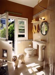
This is an inexpensive porcelain tile, the kind we all love to use, with the look of stone but the durability of a man made product. Simple squares laid on the floor, in the shower and up the walls. Not that special. Except when you add a colourful trim piece as a cap, plus a dramatic wall colour, and your inexpensive little guest bathroom is design magazine worthy. And without breaking the bank!
Another simple idea that will add interest to your basic white brick tile design:
You don’t need to find these specific tiles, the design idea is the same with any tiles. Whatever tile runs on the wall, pick a height to add a detail strip. Often a decorative tile with a design within is the easiest to add into your field tile (the field is the main tile used). In this example, we have not used a special decorative strip, simply a different colour tile in a different shape. Then added a small feature strip top and bottom to highlight, accentuate and add colour.
The same bathroom, using the same tile in a different application:
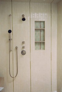
Using the same accent tiles in the back of the shower alcove lends interest to the alcove and also ties the wall tile in with the shower tile design. Another little trick to add interest here: the brick shaped tiles that run horizontally on the walls are run vertically in the shower. This is interesting and gives the illusion of height in this small room.
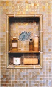
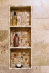
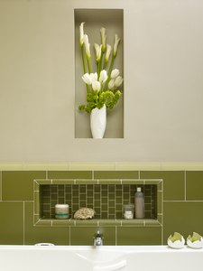
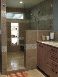
Which brings me to shower alcoves. I am absolutely mad for alcoves! Especially in bathrooms, where space is at a premium, I love to use all of those gaps between the framing boards for storage. For one of my favourite projects, we put five alcoves into one bathroom! There were two in the large shower, one above the tub, and two set into the walls for flower vases. But alcoves are also the ideal place to have some fun with tile. It’s a tiny area so the expenditure is low, but what a dramatic impact it can have! Here are just a few examples of fun alcoves I have designed:
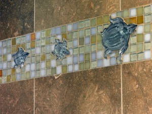
Okay, sorry, the turtles are not in an alcove, but I couldn’t resist adding them here ;-)
Some final ideas for you to think about when planning your tile designs, some simple, some not so, but all very special:
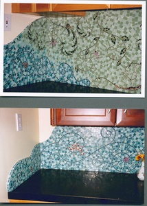
And finally, here’s a sneak peak of my custom mosaic backsplash, that moved all the way from San Francisco with me, and will soon re-appear in my Auckland home:
Happy Tiling!

